Google Play Feature Graphic Size Guide (2026): Complete Dimensions & Design Tips
Learn the correct Google Play Feature Graphic size, dimensions, safe area, file format, design best practices, common mistakes, and how to create a professional Play Store banner.
Google Play Feature Graphic Size Guide (2026)
Your Google Play Feature Graphic is one of the first visual elements users notice when they visit your app listing. A professional feature graphic helps communicate your app's identity, improves branding, and can increase installs by making your listing more attractive.
Whether you're publishing your first Android app or updating an existing listing, understanding the correct feature graphic size and Google's design recommendations is essential.
In this guide you'll learn:
- Google Play Feature Graphic size
- Required dimensions
- File format
- Safe design practices
- Typography tips
- Branding guidelines
- Common mistakes
- Google Play best practices
Need to create one quickly?
👉 Google Play Feature Graphic Generator
🚀 Quick Answer
The recommended Google Play Feature Graphic size is 1024 × 500 pixels. Use a high-quality PNG or JPG image, keep important content away from the edges, and avoid excessive text to ensure your graphic looks professional across all devices.
Google Play Feature Graphic Specifications
| Property | Requirement |
|---|---|
| Size | 1024 × 500 px |
| Aspect Ratio | 2.048 : 1 |
| Format | PNG or JPG |
| Maximum File Size | 15 MB |
| Color Space | RGB |
Table of Contents
- What Is a Google Play Feature Graphic?
- Required Dimensions
- Safe Area
- File Format
- Design Guidelines
- Typography
- Branding Tips
- Common Mistakes
- FAQ
Google Play Feature Graphic Workflow
If you're creating a feature graphic for the first time, the infographic below summarizes the complete workflow before we explain each step.
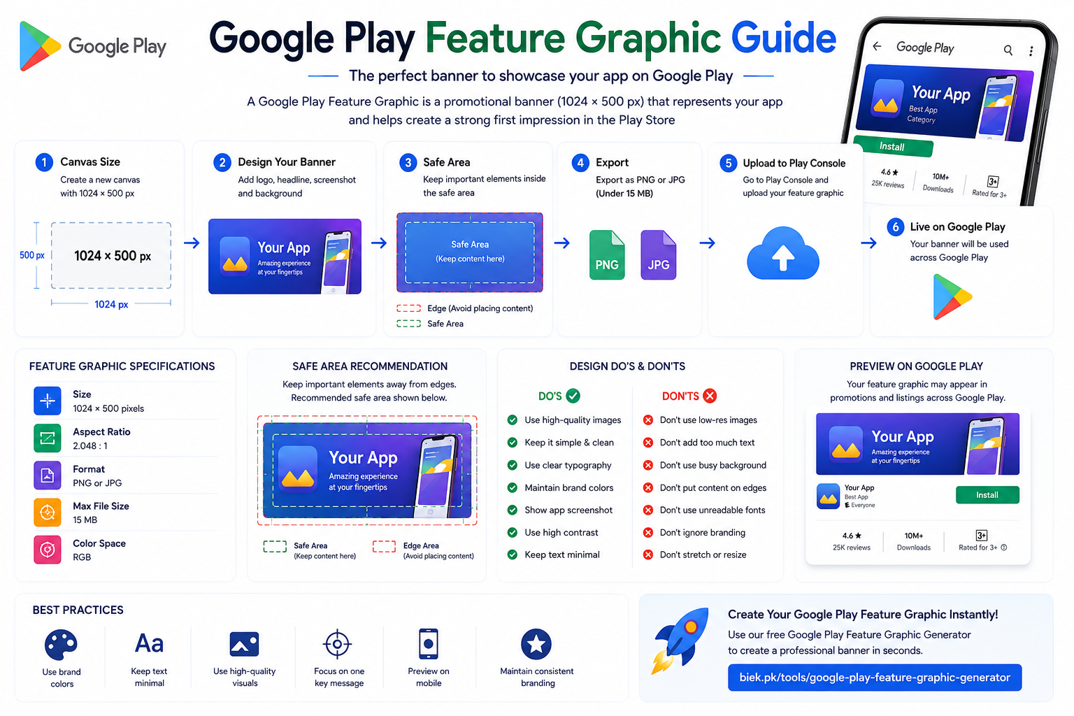
Google Play Feature Graphic workflow showing the correct 1024 × 500 dimensions, safe area, branding, typography, Google Play preview, and design best practices.
The following sections explain every stage of creating a high-converting Google Play Feature Graphic.
What Is a Google Play Feature Graphic?
A Google Play Feature Graphic is a promotional banner displayed throughout Google Play to represent your application visually.
Although it doesn't always appear directly on every app listing, it is used in several places across Google Play and is required for certain promotional opportunities.
A high-quality feature graphic can:
- Improve your app's branding
- Increase user trust
- Support marketing campaigns
- Create a professional first impression
- Help your listing stand out
Why Is It Important?
Many developers focus only on the app icon and screenshots, but the feature graphic is equally important.
A professional banner can:
- Reinforce your brand identity
- Highlight your app's main purpose
- Make your Play Store listing more visually appealing
- Improve user engagement
Even before users read your description, they often judge the quality of an app based on its visuals.
Google Play Feature Graphic Size
Google requires a fixed image size.
Official Dimensions
1024 × 500 pixels
These dimensions ensure your feature graphic displays correctly throughout Google Play.
Using any other size may result in scaling issues or upload errors.
File Format
Google Play supports:
- PNG
- JPG
PNG is generally recommended because it preserves sharp text and graphics without visible compression artifacts.
Aspect Ratio
The required aspect ratio is:
2.048 : 1
Maintaining the correct ratio prevents unwanted cropping or stretching.
Maximum File Size
Your uploaded image must be:
15 MB or smaller
Even though the limit is generous, optimizing your image helps improve upload speed and simplifies future updates.
Safe Area Guidelines
Although Google Play accepts a canvas size of 1024 × 500 pixels, you shouldn't place important elements too close to the edges.
Leave generous spacing around:
- App logo
- Main headline
- Characters
- Product images
- Important graphics
This helps ensure your feature graphic looks balanced across different Google Play layouts and promotional placements.
Recommended Layout
A simple layout often performs better than a crowded design.
A typical structure looks like this:
-----------------------------------------
 Logo

 Main Headline

 App Screenshot or Illustration

 Background Graphics
-----------------------------------------
Keep the composition clean and easy to scan.
Branding Best Practices
Your Feature Graphic should immediately communicate your app's identity.
Include:
- App logo
- Brand colors
- Consistent typography
- Visual style matching your app
Users should instantly recognize that the graphic belongs to your application.
Typography Tips
If you include text, keep it short.
Good examples include:
- Workout Smarter
- Learn Faster
- AI Photo Editor
- Track Your Fitness
- Master English
Avoid long paragraphs.
Users only spend a few seconds looking at your Play Store listing.
Background Design
Your background should support your branding rather than distract from it.
Good choices include:
- Soft gradients
- Abstract shapes
- Minimal illustrations
- Subtle patterns
Avoid:
- Busy textures
- Random stock photos
- Low-quality images
- Excessive visual effects
A clean background keeps the focus on your app.
Choosing Colors
Use colors that match your app's branding.
Popular combinations include:
- Blue & White
- Purple & Black
- Green & White
- Orange & Dark Gray
Maintain strong contrast between the background and foreground elements.
This improves readability and visual impact.
Use High-Quality Graphics
Blurry graphics immediately make an app look unprofessional.
Always use:
- SVG illustrations
- High-resolution PNGs
- Vector icons
- Retina-quality screenshots
Avoid stretching small images.
Show Your App
Whenever possible, include realistic screenshots of your application.
This helps users understand:
- What your app looks like
- What problems it solves
- Its overall design quality
A screenshot framed inside a modern smartphone mockup usually looks more professional than a floating screenshot.
Highlight Your Main Feature
Instead of listing every feature, focus on one key benefit.
Examples:
Fitness App
✔ Personalized Workout Plans
Language Learning App
✔ Learn English Faster
AI Image Generator
✔ Create Amazing AI Art
Task Manager
✔ Organize Your Day
One clear message is more memorable than ten different selling points.
Keep Plenty of White Space
White space improves readability and gives your design room to breathe.
Don't try to fill every corner.
Professional graphics often contain less content than beginners expect.
Designing for Different App Categories
Different types of apps benefit from different visual styles.
Productivity Apps
Use:
- Blue tones
- Minimal layouts
- Clean typography
- Dashboard screenshots
Fitness Apps
Use:
- High-energy colors
- Athlete photos
- Strong typography
- Bold graphics
Games
Use:
- Characters
- Action scenes
- Dynamic lighting
- Dramatic colors
Educational Apps
Use:
- Friendly illustrations
- Bright colors
- Simple icons
- Clear headlines
AI Apps
Use:
- Modern gradients
- Abstract shapes
- Futuristic lighting
- Minimal interfaces
Google Play Listing Preview
Before publishing, preview your feature graphic together with:
- App Icon
- Screenshots
- App Title
- Short Description
Everything should feel like one consistent brand.
Users notice visual consistency.
Common Design Mistakes
Many Play Store listings fail because of avoidable design issues.
Avoid these mistakes.
Too Much Text
Large blocks of text are difficult to read.
Keep headlines short.
Low Resolution
Never upload blurry graphics.
Always export at 1024 × 500 pixels.
Poor Contrast
Light text on a light background is difficult to read.
Choose contrasting colors.
Random Fonts
Use one or two professional fonts.
Too many font styles create visual clutter.
Inconsistent Branding
Your app icon, screenshots, and feature graphic should share:
- Colors
- Fonts
- Style
- Design language
Consistency builds trust.
Pro Tip
Need a professional Google Play Feature Graphic in minutes?
Our Google Play Feature Graphic Generator helps you create beautiful Play Store banners using the correct dimensions, typography, and layout—without needing Photoshop or design experience.
👉 https://biek.pk/tools/google-play-feature-graphic-generator
Google Play Feature Graphic vs App Icon
Many new Android developers confuse the Feature Graphic with the App Icon, but they serve completely different purposes.
| Feature | Google Play Feature Graphic | App Icon |
|---|---|---|
| Size | 1024 × 500 px | 512 × 512 px |
| Shape | Rectangle | Square |
| Purpose | Marketing Banner | Application Icon |
| Display Location | Google Play Store | Home Screen & Play Store |
| Branding | Full Banner | Small Logo |
Your app icon identifies your application, while the feature graphic promotes it.
Google Play Feature Graphic vs Screenshots
Screenshots and feature graphics work together but have different roles.
| Feature Graphic | Screenshots |
|---|---|
| First impression | Shows app interface |
| Branding | Demonstrates features |
| Marketing focused | Product focused |
| Single banner | Multiple images |
A great Play Store listing uses all three assets together:
- Professional App Icon
- Attractive Feature Graphic
- High-quality Screenshots
Feature Graphic Design Checklist
Before uploading your feature graphic to Google Play, make sure you've completed the following checklist.
- ✅ Correct size (1024 × 500 px)
- ✅ PNG or JPG format
- ✅ Under 15 MB
- ✅ High-resolution graphics
- ✅ Readable typography
- ✅ Consistent branding
- ✅ High contrast
- ✅ Simple composition
- ✅ Professional background
- ✅ Previewed before publishing
Following this checklist helps ensure your Play Store listing looks polished and professional.
Frequently Asked Questions
What is the Google Play Feature Graphic size?
The official Google Play Feature Graphic size is 1024 × 500 pixels with an aspect ratio of 2.048:1.
What image format should I use?
Google Play supports both PNG and JPG.
PNG is generally preferred because it preserves image quality and keeps text sharper.
What is the maximum file size?
Your feature graphic must be 15 MB or smaller.
Is the Feature Graphic required?
Although not every app listing prominently displays it, Google Play requires a feature graphic for certain promotional placements and it is considered a standard publishing asset.
Can I reuse my app icon?
No.
An app icon is designed for small square displays, while a feature graphic is a wide promotional banner.
Each asset should be designed separately.
Should I add text?
Yes—but keep it minimal.
Use one short headline instead of long paragraphs.
Can I use screenshots?
Yes.
Using clean, high-quality screenshots inside your feature graphic can help users quickly understand what your app offers.
Which colors work best?
Choose colors that match your app's branding while maintaining strong contrast between the background and foreground.
Related Guides
Continue learning with these Android publishing resources:
- Android App Icon Size Guide
- Android Adaptive Icons Guide
- Flutter Launcher Icons Guide
- React Native App Icon Guide
- Google Play Screenshot Size Guide (Coming Soon)
- Android Notification Icon Size Guide (Coming Soon)
Related Tools
Make Android publishing easier with these free tools from biek.pk:
- Google Play Feature Graphic Generator
- Android App Icon Generator
- Image Compressor
- Image Background Color Changer
These tools are designed to help developers create professional Play Store assets quickly and without expensive design software.
About This Guide
This guide is maintained by the biek.pk team and is updated regularly to reflect the latest Google Play Console requirements, Android publishing recommendations, and design best practices.
Whether you're an independent developer, Flutter developer, React Native developer, Android Studio user, or a mobile app designer, this guide aims to simplify the process of creating professional Google Play assets.
Common Feature Graphic Rejection Reasons
Many developers create a feature graphic that meets Google's size requirements but still fails to make a positive impression. While Google may accept the image, poor design can reduce click-through rates and app installs.
Here are some of the most common mistakes to avoid.
Low-Quality Images
Blurry or pixelated graphics make an app appear unfinished.
Always export your artwork at the full 1024 × 500 pixel resolution.
Never upscale a small image.
Cluttered Design
Trying to display every feature on one banner usually creates visual clutter.
Instead:
- Focus on one key message.
- Use one primary illustration or screenshot.
- Keep the layout clean.
Less is often more.
Poor Typography
Avoid:
- Decorative fonts
- Tiny text
- Multiple font families
Choose one modern font and use a clear hierarchy with a large headline and minimal supporting text.
Weak Branding
Your feature graphic should immediately reflect your app's identity.
Maintain consistency across:
- App icon
- Screenshots
- Feature graphic
- Colors
- Typography
Consistent branding helps users recognize and trust your app.
Ignoring Mobile Users
Most Play Store visitors browse on smartphones.
Always preview your feature graphic on a mobile screen to ensure:
- Text remains readable.
- Key visuals are visible.
- Important content isn't too close to the edges.
Publishing Checklist
Before uploading your feature graphic to Google Play Console, verify the following:
- ✅ Canvas size is 1024 × 500 px
- ✅ PNG or JPG format
- ✅ File size is under 15 MB
- ✅ High-resolution images only
- ✅ Strong branding
- ✅ Readable typography
- ✅ High contrast
- ✅ Minimal text
- ✅ Clean composition
- ✅ Preview checked on desktop and mobile
Completing this checklist helps create a professional Play Store listing.
Recommended Workflow
For the best results, follow this simple workflow:
- Design your app icon.
- Create your feature graphic.
- Prepare your screenshots.
- Compress images if necessary.
- Upload assets to Google Play Console.
- Preview your listing.
- Publish your app.
Following the same workflow every time saves time and helps maintain consistent branding.
Free Tools for Android Developers
At biek.pk, we've created free tools to simplify Android app publishing.
Google Play Feature Graphic Generator
Generate a professional feature graphic using the correct dimensions and layout.
Android App Icon Generator
Create launcher icons and Google Play icons from a single high-resolution image.
Image Compressor
Reduce image file sizes without noticeable quality loss before uploading to Play Console.
Image Background Color Changer
Quickly change image backgrounds for promotional graphics and app assets.
These tools are designed for Android developers, Flutter developers, React Native developers, designers, and indie app creators.
Related Articles
If you're preparing your app for Google Play, these guides will help:
- Android App Icon Size Guide
- Android Adaptive Icons Guide
- Flutter Launcher Icons Guide
- React Native App Icon Guide
- Google Play Screenshot Size Guide (Coming Soon)
- Android Notification Icon Size Guide (Coming Soon)
Reading these guides together will give you a complete understanding of Google Play Store asset requirements.
About This Guide
The Google Play Feature Graphic Size Guide is maintained by the biek.pk team.
We regularly review Google's latest Play Console recommendations and update this guide whenever publishing requirements or design best practices change.
Our goal is to provide developers with practical, easy-to-follow resources that make Android app publishing simpler and more successful.
Conclusion
A well-designed Google Play Feature Graphic does much more than meet Google's technical requirements. It strengthens your branding, creates a positive first impression, and helps communicate your app's value before users even read the description.
By using the correct 1024 × 500 pixel dimensions, keeping your design clean, maintaining consistent branding, and following the best practices outlined in this guide, you can create a feature graphic that looks professional and supports your app's marketing efforts.
If you want to save time, use our free Google Play Feature Graphic Generator to create correctly sized, professional-looking graphics in minutes—no advanced design skills required.
🚀 Create Your Google Play Feature Graphic
Ready to design a professional Play Store banner?
Use our Google Play Feature Graphic Generator to create high-quality feature graphics with the correct dimensions, modern layouts, and branding-ready designs—all for free.