Android Notification Icon Size Guide (2026): Dimensions, Design & Best Practices
Learn the correct Android notification icon size, dimensions, design guidelines, adaptive notification icons, status bar icons, and Android Studio implementation.
Android Notification Icon Size Guide (2026)
Notification icons are one of the smallest yet most important visual assets in Android development. Every notification shown in the Android status bar uses a notification icon to represent your application.
Unlike launcher icons, notification icons follow strict Android design guidelines. They are monochrome, simple, and optimized for visibility in the status bar.
Whether you're developing with Android Studio, Flutter, or React Native, understanding notification icon requirements helps ensure your app looks professional on every Android device.
In this guide you'll learn:
- Android notification icon size
- Status bar icon dimensions
- Supported formats
- Android Studio implementation
- Flutter notification icons
- React Native notification icons
- Common mistakes
- Design best practices
Need Android icons?
🚀 Quick Answer
Android notification icons should be simple white monochrome icons with a transparent background. They are automatically tinted by Android and displayed in the status bar and notification panel.
Android Notification Icon Specifications
| Property | Recommendation |
|---|---|
| Style | Monochrome |
| Background | Transparent |
| Color | White |
| Format | PNG |
| Launcher Icon | ❌ Not Recommended |
| Adaptive Icon | ❌ Not Used |
Table of Contents
- What Is an Android Notification Icon?
- Notification Icon Sizes
- Android Density Buckets
- Status Bar Icons
- Android Studio
- Flutter
- React Native
- Design Guidelines
- Common Mistakes
- FAQ
Android Notification Icon Workflow
If you're creating notification icons for the first time, the infographic below summarizes the complete workflow before we explain every step.
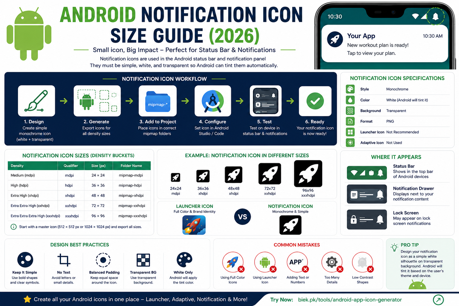
Android Notification Icon workflow showing monochrome icon design, density buckets, Android Studio implementation, Flutter, React Native, and notification panel preview.
The following sections explain every step in detail.
What Is an Android Notification Icon?
A notification icon is the small icon displayed:
- In the Android status bar
- Inside the notification drawer
- On lock screen notifications
Unlike launcher icons, notification icons are not colorful.
Android automatically applies the system notification color, which is why the icon should be designed as a white silhouette with a transparent background.
Why Notification Icons Are Different
Many beginners simply reuse their launcher icon.
This is one of the most common Android design mistakes.
Launcher icons:
- Full color
- Rounded
- Adaptive
- Branding focused
Notification icons:
- White only
- Transparent background
- Flat design
- Status bar optimized
These two icon types serve completely different purposes.
Notification Icon Sizes
Android generates notification icons for multiple screen densities.
| Density | Size |
|---|---|
| mdpi | 24 × 24 px |
| hdpi | 36 × 36 px |
| xhdpi | 48 × 48 px |
| xxhdpi | 72 × 72 px |
| xxxhdpi | 96 × 96 px |
Starting with a large master icon ensures every generated size remains sharp.
Create a High-Resolution Master Icon
A good workflow starts with a large source image.
Recommended:
512 × 512 px
or
1024 × 1024 px
From this master icon, export all required notification icon sizes.
Status Bar Icons
Notification icons appear in the Android status bar.
Because they are displayed at very small sizes, they should:
- Be simple
- Have bold shapes
- Avoid fine details
- Avoid text
- Remain recognizable at a glance
Minimal icons perform much better than detailed logos.
Android Density Buckets Explained
Android devices come in many different screen densities. To ensure notification icons remain crisp on every device, Android uses density-specific resources.
The main density buckets are:
| Density | Folder | Icon Size |
|---|---|---|
| mdpi | mipmap-mdpi | 24 × 24 px |
| hdpi | mipmap-hdpi | 36 × 36 px |
| xhdpi | mipmap-xhdpi | 48 × 48 px |
| xxhdpi | mipmap-xxhdpi | 72 × 72 px |
| xxxhdpi | mipmap-xxxhdpi | 96 × 96 px |
When Android displays a notification, it automatically selects the most appropriate icon for the device's screen density.
This ensures the icon remains sharp without unnecessary scaling.
Why Android Uses Multiple Sizes
Imagine using a single 24 × 24 icon on a modern 4K smartphone.
Android would need to enlarge it, making it blurry.
Likewise, using only a very large icon on an older device wastes storage and memory.
Density buckets solve this problem by providing optimized resources for every screen resolution.
Notification Icons vs Launcher Icons
Developers often confuse notification icons with launcher icons.
Although both represent your application, they are designed for completely different purposes.
| Launcher Icon | Notification Icon |
|---|---|
| Full color | White only |
| Adaptive icon | Flat icon |
| Background allowed | Transparent background |
| Branding focused | Simple symbol |
| Displayed on home screen | Displayed in status bar |
| Large size | Very small size |
Never use your launcher icon directly as a notification icon.
Notification Icons vs Adaptive Icons
Adaptive icons were introduced in Android 8 (Oreo) to provide a consistent appearance across different launcher shapes.
Notification icons do not use adaptive icon layers.
| Adaptive Icon | Notification Icon |
|---|---|
| Foreground layer | Not supported |
| Background layer | Not supported |
| Rounded automatically | No |
| White silhouette | Yes |
| Transparent background | Yes |
They serve different purposes and require separate assets.
Design Guidelines
Google recommends notification icons that are clean, recognizable, and easy to identify at small sizes.
Follow these principles.
Keep the Design Simple
Notification icons often appear at only a few pixels in height.
Avoid:
- Complex illustrations
- Small decorative elements
- Thin outlines
- Tiny symbols
Simple icons remain recognizable even on compact status bars.
Use Bold Shapes
Strong silhouettes improve visibility.
Good examples include:
- Bell
- Camera
- Chat bubble
- Rocket
- Music note
- Shopping bag
- Heart
Avoid detailed logos that lose clarity when scaled down.
Use White Only
Android automatically tints notification icons based on the system theme.
Your source image should therefore contain only:
- White foreground
- Transparent background
Do not add gradients, shadows, or colored elements.
Avoid Text
Text becomes unreadable at notification icon sizes.
Do not include:
- App initials
- Company names
- Numbers
- Labels
- Slogans
Instead, use a recognizable symbol that represents your app.
Maintain Transparent Background
Notification icons should have a transparent background.
Adding a solid square or circular background can make the icon appear incorrect when Android applies system tinting.
Safe Padding
Leave sufficient empty space around the icon.
Icons that touch the image edges may appear cropped or cramped in the notification bar.
Balanced padding improves clarity across all Android devices.
Recommended Master File
Rather than drawing five separate notification icons manually, create one high-resolution master file.
Recommended size:
1024 × 1024 px
or
512 × 512 px
Then export the required density sizes automatically.
This approach saves time and keeps all versions visually consistent.
Using Android Studio Image Asset Tool
Android Studio includes an Image Asset Studio that can generate notification icons for every density.
To create a notification icon:
- Open Android Studio.
- Right-click the res folder.
- Select New → Image Asset.
- Choose Notification Icons.
- Import your white transparent PNG.
- Review the preview.
- Generate all density folders.
Android Studio automatically creates icons for:
- mdpi
- hdpi
- xhdpi
- xxhdpi
- xxxhdpi
This reduces manual work and helps avoid sizing errors.
Where Notification Icons Are Stored
Android Studio saves generated icons inside the project's resource folders.
Typical locations include:
app/
└── src/
    └── main/
        └── res/
            ├── mipmap-mdpi/
            ├── mipmap-hdpi/
            ├── mipmap-xhdpi/
            ├── mipmap-xxhdpi/
            └── mipmap-xxxhdpi/
Keeping icons organized inside these folders allows Android to automatically select the correct resource for each device.
Preview Before Publishing
Before releasing your app, always test notification icons on:
- Light theme
- Dark theme
- Different Android versions
- Small phones
- Large phones
- Tablets (if supported)
A notification icon that looks good on one device may appear too small or too detailed on another.
Testing across multiple devices helps ensure a consistent experience for all users.
Flutter Notification Icons
Flutter applications commonly use notification icons with packages such as:
- firebase_messaging
- flutter_local_notifications
- awesome_notifications
Unlike the launcher icon, these packages require a dedicated notification icon.
Using the launcher icon often results in a solid white square or an improperly rendered notification because Android automatically tints notification icons.
Creating a Flutter Notification Icon
A recommended workflow is:
- Design a white monochrome PNG.
- Keep the background transparent.
- Generate all Android density sizes.
- Place the generated files inside the Android
resfolders. - Reference the icon in your notification configuration.
This approach ensures notifications appear correctly across Android devices.
Firebase Cloud Messaging (FCM)
Firebase Cloud Messaging (FCM) is Google's official push notification service.
When sending notifications to Android devices, FCM uses the notification icon specified in your application.
If no notification icon is configured, Android may display:
- The application launcher icon
- A generic system icon
- A white square
- An incorrectly cropped image
Providing a dedicated notification icon avoids these issues.
Local Notifications
Many applications also display local notifications for reminders, alarms, timers, and scheduled events.
Examples include:
- Workout reminders
- Medication alerts
- Calendar events
- Prayer reminders
- Task notifications
- Water intake reminders
These notifications should also use the same notification icon for consistency.
React Native Notification Icons
React Native applications typically use notification libraries such as:
- Notifee
- React Native Push Notification
- Firebase Messaging
The notification icon requirements remain exactly the same:
- White icon
- Transparent background
- PNG format
- Multiple density folders
The development framework does not change Android's notification icon guidelines.
Jetpack Compose Applications
If you're building modern Android applications using Jetpack Compose, notification icons still rely on Android's resource system.
Compose changes the UI framework but does not change how notification icons are created or displayed.
The icon should still be placed inside the appropriate resource directories and referenced by your notification code.
Material Design Recommendations
Android's Material Design emphasizes clarity and simplicity.
A good notification icon should:
- Be instantly recognizable
- Use a clean silhouette
- Avoid unnecessary decoration
- Remain legible at very small sizes
Remember that notification icons are functional UI elements rather than branding assets.
Common Notification Icon Mistakes
Many developers unknowingly make mistakes that reduce the quality of their notifications.
Using the Launcher Icon
The most common mistake is using the launcher icon directly.
Because launcher icons contain colors, gradients, and adaptive layers, Android cannot render them correctly in the status bar.
Always create a separate notification icon.
Using Colored Icons
Notification icons should never include:
- Red
- Blue
- Green
- Yellow
- Gradients
- Shadows
Android automatically applies the appropriate tint based on the user's device theme.
Adding Background Shapes
Avoid placing your icon inside:
- Squares
- Circles
- Rounded rectangles
- Colored backgrounds
The background should always remain transparent.
Making the Icon Too Detailed
Fine lines disappear at small sizes.
Instead of detailed artwork, use:
- Simple symbols
- Bold outlines
- Clear shapes
This improves visibility on all Android devices.
Using Low-Resolution Images
Blurry notification icons create an unprofessional appearance.
Always begin with a high-resolution master file before exporting density-specific versions.
Ignoring Dark Mode
Android automatically adapts notification colors for different themes.
Test your notification icon in:
- Light mode
- Dark mode
Ensure the icon remains clearly visible in both.
Testing Notification Icons
Before publishing your application, verify your notification icon by testing:
- Push notifications
- Local notifications
- Foreground notifications
- Background notifications
- Locked screen notifications
Also test on multiple Android versions to ensure consistent behavior.
Notification Icon Checklist
Use this checklist before releasing your app:
- ✅ White monochrome icon
- ✅ Transparent background
- ✅ PNG format
- ✅ High-resolution master file
- ✅ All density buckets generated
- ✅ No gradients or shadows
- ✅ No text
- ✅ Simple silhouette
- ✅ Tested on light theme
- ✅ Tested on dark theme
- ✅ Verified on physical Android devices
Following these practices helps ensure your notifications look professional and comply with Android design guidelines.
Save Time with an Icon Generator
Instead of manually resizing notification icons for every Android density, use an icon generation tool to automate the process.
A good generator should:
- Export all Android density sizes
- Create launcher icons
- Generate adaptive icons
- Produce notification icons
- Organize files into the correct folder structure
This reduces manual work and minimizes the risk of sizing or placement errors.
For developers maintaining multiple apps, an automated workflow can save significant time while keeping icon assets consistent.
Notification Icon vs Launcher Icon vs Adaptive Icon
Android uses different icon types for different purposes. Understanding these differences helps you prepare the correct assets for your application.
| Feature | Notification Icon | Launcher Icon | Adaptive Icon |
|---|---|---|---|
| Purpose | Notifications & Status Bar | Home Screen | Modern Android Launchers |
| Colors | White Only | Full Color | Full Color |
| Background | Transparent | Allowed | Separate Background Layer |
| Adaptive Layers | No | No | Yes |
| Display Size | Very Small | Medium | Medium |
| File Format | PNG | PNG | XML + PNG |
| Auto Tinting | Yes | No | No |
Each icon type serves a different role, so avoid reusing one icon for all purposes.
Notification Icon Design Tips
Following a few simple design principles can significantly improve the appearance of your Android notifications.
Keep It Recognizable
Choose a symbol that users can instantly identify, even at a very small size.
Use Balanced Padding
Leave enough empty space around the icon to prevent it from looking cramped in the status bar.
Test on Multiple Devices
Notification icons may appear slightly different across Android manufacturers such as Samsung, Google Pixel, Xiaomi, OnePlus, Oppo, Vivo, and Motorola.
Maintain Brand Identity
Even though notification icons are monochrome, try to use a symbol that reflects your app's branding.
For example:
- Chat app → Chat bubble
- Camera app → Camera
- Shopping app → Shopping bag
- Music app → Music note
- Finance app → Wallet
- Fitness app → Dumbbell or Heartbeat
Frequently Asked Questions
What size should an Android notification icon be?
Android generates notification icons for different screen densities.
The common sizes are:
- 24 × 24 px (mdpi)
- 36 × 36 px (hdpi)
- 48 × 48 px (xhdpi)
- 72 × 72 px (xxhdpi)
- 96 × 96 px (xxxhdpi)
Can I use my launcher icon as a notification icon?
No.
Launcher icons are colorful and adaptive, while notification icons must be simple white icons with transparent backgrounds.
Using a launcher icon often results in poor rendering in the notification bar.
Why is my notification icon showing as a white square?
This usually happens because the source image:
- Contains colors
- Has a solid background
- Is not transparent
- Is using the launcher icon instead of a notification icon
Create a dedicated monochrome notification icon to resolve the issue.
Should notification icons be transparent?
Yes.
Only the foreground symbol should be visible.
The background must remain transparent.
Can notification icons contain text?
No.
Text becomes unreadable at small sizes and is discouraged by Android design guidelines.
Use simple graphical symbols instead.
Which image format should I use?
PNG is the recommended format because it supports transparency and preserves image quality.
Do Flutter apps require notification icons?
Yes.
Flutter applications that use local notifications or Firebase Cloud Messaging should provide dedicated Android notification icons.
Do React Native apps require notification icons?
Yes.
React Native applications follow the same Android notification icon requirements as native Android apps.
Do notification icons support colors?
No.
Android automatically applies the appropriate tint based on the system theme.
Your original icon should be white on a transparent background.
Can I generate notification icons automatically?
Yes.
Many Android icon generators export all required notification icon sizes, launcher icons, and adaptive icons from a single high-resolution image, saving time and reducing manual work.
Related Guides
Continue learning with these Android publishing resources:
- Android App Icon Size Guide
- Android Adaptive Icons Guide
- Flutter Launcher Icons Guide
- React Native App Icon Guide
- Google Play Screenshot Size Guide
- Google Play Feature Graphic Size Guide
Related Tools
Our free tools make Android asset creation faster and easier.
Android App Icon Generator
Generate launcher icons, adaptive icons, and notification icons in every required Android density from a single image.
Google Play Feature Graphic Generator
Create Play Store feature graphics with the correct dimensions and safe areas.
Image Compressor
Compress PNG, JPG, and WebP images before uploading them to Google Play.
Image Background Color Changer
Replace or customize image backgrounds to create cleaner Android marketing assets.
About This Guide
This guide is maintained by the biek.pk team and updated regularly to reflect current Android development practices and Google recommendations.
Our goal is to help Android developers, Flutter developers, and React Native developers create professional assets that improve app quality and simplify the publishing process.
Whether you're launching your first Android app or maintaining multiple applications, following these guidelines will help ensure your notification icons look consistent across devices and Android versions.
Conclusion
Android notification icons may be small, but they play an important role in your app's user experience. A clean, properly designed notification icon improves visibility in the status bar, strengthens brand recognition, and ensures notifications look professional across different Android devices.
By using monochrome icons with transparent backgrounds, exporting the correct density sizes, and testing on multiple devices, you can avoid common rendering issues and provide a polished experience for your users.
If you're preparing your app for release, don't rely on your launcher icon. Create a dedicated notification icon that follows Android's design guidelines and works seamlessly with both local notifications and Firebase Cloud Messaging.
🚀 Generate Android Icons in Seconds
Need launcher icons, adaptive icons, and notification icons without manually resizing every asset?
Use our Android App Icon Generator to create all required Android icon sizes from a single high-resolution image.
✔ Launcher Icons
✔ Adaptive Icons
✔ Notification Icons
✔ Play Store Assets
Start now: /tools/android-app-icon-generator