Android Adaptive Icons Guide (2026): Complete Design & Implementation Tutorial
Learn everything about Android Adaptive Icons including icon sizes, safe zones, foreground, background, implementation, Android Studio, Flutter, React Native, and Google Play best practices.
Android Adaptive Icons Guide (2026)
Adaptive Icons are one of the most important improvements introduced in modern Android. Unlike traditional launcher icons, Adaptive Icons automatically adjust their appearance based on the device's launcher, providing a cleaner and more consistent experience across different Android phones.
Whether you're building apps using Android Studio, Flutter, or React Native, understanding Adaptive Icons is essential before publishing your application on Google Play.
In this guide you'll learn:
- What Android Adaptive Icons are
- Foreground and background layers
- Safe zone
- Icon sizes
- Android Studio implementation
- Flutter support
- React Native support
- Best practices
- Common mistakes
- Publishing tips
Need a properly sized app icon?
🚀 Quick Answer
Android Adaptive Icons use two separate layers—a foreground and a background—to automatically adapt the launcher icon shape on different Android devices. Keeping your logo inside the safe zone prevents important elements from being cropped.
Android Adaptive Icons at a Glance
| Feature | Supported |
|---|---|
| Android 8.0+ | ✅ Yes |
| Foreground Layer | ✅ Yes |
| Background Layer | ✅ Yes |
| Launcher Shapes | Circle, Squircle, Rounded Square, Teardrop |
| Google Play Compatible | ✅ Yes |
Table of Contents
- What Are Android Adaptive Icons?
- Why Adaptive Icons Matter
- Safe Zone
- Foreground Layer
- Background Layer
- Icon Sizes
- Android Studio
- Flutter
- React Native
- Best Practices
- FAQ
Android Adaptive Icons Workflow
If you're new to Adaptive Icons, the infographic below summarizes the complete workflow before we explain every step in detail.
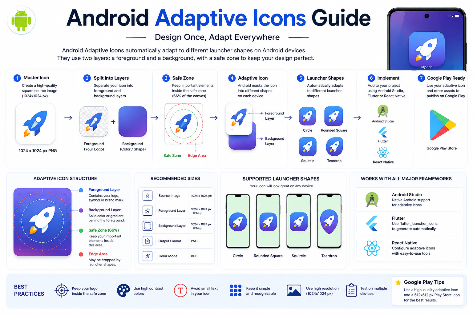
Complete Android Adaptive Icons workflow showing foreground layer, background layer, safe zone, launcher shapes, Android Studio, Flutter, React Native, and publishing best practices.
The following sections explain every concept shown in the infographic with practical examples and implementation tips.
What Are Android Adaptive Icons?
Android Adaptive Icons are launcher icons introduced in Android 8.0 (API Level 26).
Instead of using one fixed square image, Adaptive Icons combine two separate layers:
- Foreground
- Background
Android automatically masks these layers into different launcher shapes depending on the device manufacturer.
This allows the same application icon to look consistent across Samsung, Google Pixel, Xiaomi, OnePlus, Oppo, Vivo, and other Android devices.
Why Adaptive Icons Matter
Before Adaptive Icons, Android launchers displayed traditional square icons.
Modern launchers now support:
- Circle
- Rounded Square
- Squircle
- Teardrop
- OEM Custom Shapes
Without Adaptive Icons, your application may appear inconsistent or poorly cropped on different devices.
Using Adaptive Icons helps:
- Improve visual consistency
- Follow Android guidelines
- Create a modern appearance
- Enhance user trust
- Improve branding
Android Adaptive Icon Structure
Every Adaptive Icon contains two independent images.
Foreground Layer
This contains your:
- Logo
- Symbol
- Brand mark
The foreground should never touch the edges.
Background Layer
The background is normally:
- Solid color
- Gradient
- Simple illustration
Avoid adding detailed artwork here.
Adaptive Icon Safe Zone
One of the most important concepts is the Safe Zone.
Keep your logo inside the center safe area.
Doing this prevents Android launcher masks from cutting off important parts of your design.
Never place:
- Text
- Logos
- Important shapes
close to the outer edges.
Android Adaptive Icon Sizes
Although Adaptive Icons use two separate layers, they still follow Android's launcher icon guidelines.
For the best quality, start with a high-resolution source image.
| Property | Recommendation |
|---|---|
| Source Image | 1024 × 1024 px |
| Format | PNG |
| Shape | Square |
| Background | Transparent or Solid |
| Quality | High Resolution |
Using a large master image ensures your Adaptive Icons remain sharp across different Android devices.
Android Adaptive Icon Layers
Adaptive Icons consist of two independent image layers.
Foreground Layer
The foreground layer contains your application's branding.
Examples include:
- Company logo
- App symbol
- Product icon
Always keep important elements inside the center safe zone.
Avoid placing logos too close to the edges.
Background Layer
The background layer sits behind the foreground.
Common choices include:
- Solid colors
- Soft gradients
- Minimal illustrations
Avoid detailed artwork because launcher masks may hide portions of the background.
Supported Launcher Shapes
Different Android manufacturers display launcher icons differently.
Common launcher masks include:
- Circle
- Rounded Square
- Squircle
- Teardrop
Because Android automatically changes the icon shape, your design should work well regardless of which launcher mask is applied.
Android Studio Implementation
Android Studio fully supports Adaptive Icons.
Launcher icons are usually stored inside:
app/src/main/res/mipmap-anydpi-v26/
An Adaptive Icon typically references:
- Foreground drawable
- Background drawable
Android combines these resources automatically when displaying your application icon.
Adaptive Icon XML
A basic Adaptive Icon XML file looks like this:
<?xml version="1.0" encoding="utf-8"?>
<adaptive-icon xmlns:android="http://schemas.android.com/apk/res/android">

    <background
        android:drawable="@color/ic_launcher_background"/>

    <foreground
        android:drawable="@drawable/ic_launcher_foreground"/>

</adaptive-icon>
The foreground and background are combined automatically by Android.
Flutter Adaptive Icons
Flutter applications also support Adaptive Icons.
When using flutter_launcher_icons, simply configure:
flutter_launcher_icons:

  android: true

  adaptive_icon_background: "#FFFFFF"

  adaptive_icon_foreground: assets/icon_foreground.png
Then run:
dart run flutter_launcher_icons
The package automatically creates Adaptive Icons for Android.
React Native Adaptive Icons
React Native projects can also use Adaptive Icons.
Most React Native icon generation tools automatically generate:
- Android launcher icons
- Adaptive icons
- Foreground layer
- Background layer
Always verify the generated icon on multiple Android devices before publishing.
How Android Uses Adaptive Icons
Once installed, Android dynamically applies launcher masks.
For example:
Samsung:
Rounded Square
Google Pixel:
Circle
Xiaomi:
Squircle
OnePlus:
Rounded Square
The same application icon may appear slightly different depending on the manufacturer's launcher.
Why the Safe Zone Matters
One of the most common mistakes is designing an icon that fills the entire canvas.
Android launcher masks crop the outer edges.
Without enough padding:
- Logos may be cut off.
- Text may disappear.
- Corners may be clipped.
Keeping your design centered prevents these issues.
Common Implementation Mistakes
Many developers accidentally create poor Adaptive Icons.
Avoid these mistakes.
Using One Flat Image
Adaptive Icons require separate foreground and background layers.
No Padding
Leaving no empty space around the logo often causes clipping.
Complex Backgrounds
Detailed backgrounds rarely look good after launcher masking.
Simple backgrounds work much better.
Tiny Text
Text becomes unreadable on launcher icons.
Use symbols instead of words whenever possible.
Wrong Image Size
Small images often become blurry.
Always begin with:
1024 × 1024 PNG
Pro Tip
Need a properly sized source image before creating Adaptive Icons?
Our Android App Icon Generator automatically creates:
- Android Launcher Icons
- Google Play Icon
- High-Resolution PNG
ready for Android Studio, Flutter, React Native, and Adaptive Icons.
👉 https://biek.pk/tools/android-app-icon-generator
Designing Great Android Adaptive Icons
Creating an Adaptive Icon isn't only about following Android's technical requirements. A well-designed icon also improves brand recognition, user trust, and app downloads.
Whether you're creating an app for Google Play or distributing it privately, investing time in icon design makes your application look more polished and professional.
Keep the Design Simple
The best Android app icons are simple and instantly recognizable.
Avoid adding unnecessary details such as:
- Long text
- Small icons
- Complex illustrations
- Thin lines
- Busy backgrounds
A clean design is much easier to recognize on a home screen.
Use Bold Shapes
Launcher icons are displayed at small sizes.
Strong geometric shapes remain visible even when the icon is reduced.
Good examples include:
- Simple logos
- Letters
- Abstract symbols
- Minimal illustrations
Avoid thin strokes that disappear on smaller screens.
Choose High Contrast Colors
Your foreground should stand out clearly against the background.
Good combinations include:
- White on Blue
- Black on Yellow
- White on Green
- White on Red
- Blue on White
Poor contrast makes icons difficult to recognize.
Leave Enough Padding
One of the biggest mistakes developers make is enlarging the logo until it nearly touches the edges.
Adaptive Icons require padding because Android launcher masks crop the outer portions of the icon.
Always keep your logo comfortably inside the safe zone.
This ensures your icon looks great on:
- Samsung
- Google Pixel
- Xiaomi
- Oppo
- Vivo
- OnePlus
- Motorola
Avoid Using Text
Text rarely works well inside launcher icons.
Small words quickly become unreadable.
Instead of writing your app name, use:
- Your logo
- A recognizable symbol
- A unique brand mark
The app name is already displayed below the icon on the home screen.
Don't Overcomplicate the Background
Your background layer should support the foreground rather than compete with it.
Recommended backgrounds include:
- Solid colors
- Soft gradients
- Simple geometric patterns
Avoid photographs or highly detailed artwork.
Best Tools for Designing Adaptive Icons
Several design tools make it easy to create professional Android Adaptive Icons.
Figma
Figma is an excellent option for creating modern app icons.
Benefits include:
- Vector graphics
- Easy alignment
- Reusable components
- Team collaboration
Adobe Illustrator
Illustrator is ideal for scalable vector artwork.
Because vectors never lose quality, they're perfect for creating master app icons.
Adobe Photoshop
Photoshop works well when designing icons with:
- Realistic textures
- Shadows
- Lighting effects
Always export your final artwork as a high-resolution PNG.
Canva
Canva is beginner-friendly and provides thousands of templates.
It's a great option for developers who don't have advanced design experience.
However, always customize templates to maintain a unique brand identity.
AI Tools for Icon Design
AI image generation tools can help you brainstorm icon ideas.
Popular options include:
- ChatGPT Image Generation
- Gemini
- Adobe Firefly
- Midjourney
- Leonardo AI
After generating an icon, refine it in Figma or Illustrator before using it in your application.
Test Your Icon Before Publishing
Before uploading your app to Google Play, preview your icon on different Android launchers.
Check that:
- The logo isn't cropped.
- The foreground remains centered.
- Colors remain vibrant.
- Small details are still visible.
- The icon looks good in both light and dark wallpapers.
Testing across multiple devices helps you catch design issues early.
Common Design Mistakes
Avoid these frequent mistakes when creating Adaptive Icons.
Tiny Details
Small decorative elements often disappear on mobile devices.
Keep the design bold and uncluttered.
Weak Color Contrast
Low-contrast icons blend into the home screen and become difficult to identify.
Choose colors that stand out.
Using Photos as Icons
Photographs usually don't scale well as launcher icons.
Simple graphic illustrations perform much better.
Ignoring the Safe Zone
Important parts of the logo should never extend beyond the safe area.
Otherwise, Android launcher masks may crop them.
Using Low-Resolution Images
Starting with a small image often produces blurry launcher icons.
Always begin with a high-quality source image of at least 1024 × 1024 pixels.
Professional Design Checklist
Before publishing your Android app, make sure your icon meets these requirements:
- ✅ High-resolution PNG
- ✅ Square canvas
- ✅ Foreground and background separated
- ✅ Logo inside the safe zone
- ✅ Strong color contrast
- ✅ Simple, recognizable design
- ✅ No small text
- ✅ Tested on multiple launcher shapes
- ✅ Looks good on light and dark wallpapers
- ✅ Consistent with your app branding
Following this checklist helps ensure your Adaptive Icon looks polished across all Android devices.
Related Guides
If you're publishing an Android app, these guides will also help:
- Android App Icon Size Guide
- Flutter Launcher Icons Guide
- React Native App Icon Guide
- Google Play Feature Graphic Size Guide (Coming Soon)
- Android Notification Icon Size Guide (Coming Soon)
Android Adaptive Icons vs Traditional Launcher Icons
Many developers wonder whether they should still use traditional launcher icons or switch to Adaptive Icons.
The answer is simple: Adaptive Icons are the modern standard for Android 8.0 (API level 26) and above.
| Feature | Traditional Icon | Adaptive Icon |
|---|---|---|
| Separate Foreground & Background | ❌ No | ✅ Yes |
| Supports Different Launcher Shapes | ❌ No | ✅ Yes |
| Modern Android Design | ❌ Limited | ✅ Yes |
| Google Recommended | ⚠️ Older Method | ✅ Yes |
| Better User Experience | ⭐⭐⭐ | ⭐⭐⭐⭐⭐ |
If your application targets modern Android devices, Adaptive Icons should always be your preferred choice.
Android Adaptive Icons vs Flutter Launcher Icons
Many developers confuse these two concepts, but they serve different purposes.
| Android Adaptive Icons | Flutter Launcher Icons |
|---|---|
| Android feature | Flutter package |
| Defines foreground and background layers | Automatically generates launcher icons |
| Used by Android launchers | Used during Flutter build process |
| XML-based configuration | YAML configuration |
| Platform-specific | Flutter-specific |
The flutter_launcher_icons package simply generates the Android Adaptive Icon resources automatically.
Android Adaptive Icons vs React Native
React Native also supports Adaptive Icons through configuration files and third-party packages.
The overall concept remains the same:
- Foreground layer
- Background layer
- Safe zone
- Launcher masking
The only difference is how each framework generates the required Android resources.
Frequently Asked Questions
What is an Android Adaptive Icon?
An Android Adaptive Icon is a launcher icon made from two separate layers—a foreground and a background—that Android automatically masks into different shapes depending on the device.
When were Adaptive Icons introduced?
Adaptive Icons were introduced with Android 8.0 Oreo (API Level 26).
What is the recommended image size?
Start with a 1024 × 1024 pixel PNG.
This provides enough resolution for generating all required launcher icons.
Can I use one image instead of two layers?
Technically, you can, but it's not recommended.
Using separate foreground and background layers provides the best appearance across different launcher shapes.
Why is my logo getting cropped?
Your logo is probably extending beyond the safe zone.
Move the important elements closer to the center and leave enough padding around the edges.
Do Flutter apps support Adaptive Icons?
Yes.
The flutter_launcher_icons package can automatically generate Adaptive Icons using separate foreground and background images.
Does React Native support Adaptive Icons?
Yes.
Most React Native icon generation tools support Android Adaptive Icons.
Should every Android app use Adaptive Icons?
Yes.
If your application supports Android 8.0 or newer, using Adaptive Icons is considered a best practice.
Final Checklist
Before publishing your app, make sure you've completed the following:
- ✅ Designed a high-resolution master icon (1024 × 1024 px)
- ✅ Created separate foreground and background layers
- ✅ Kept your logo inside the safe zone
- ✅ Used strong color contrast
- ✅ Tested the icon on multiple launcher shapes
- ✅ Verified the icon on physical Android devices
- ✅ Generated all required launcher icon sizes
- ✅ Prepared a Google Play Store icon
Related Resources
Continue learning with these guides:
- Android App Icon Size Guide
- Flutter Launcher Icons Guide
- React Native App Icon Guide
- Google Play Feature Graphic Size Guide (Coming Soon)
- Google Play Screenshot Size Guide (Coming Soon)
- Android Notification Icon Size Guide (Coming Soon)
You can also explore our free developer tools:
- Android App Icon Generator
- Google Play Feature Graphic Generator
- Image Compressor
- Image Background Color Changer
About This Guide
This guide is maintained by the biek.pk development team and is updated regularly to reflect the latest Android design recommendations and Google Play publishing requirements.
Our goal is to help Android developers, Flutter developers, React Native developers, designers, and beginners create professional mobile applications with confidence.
Conclusion
Android Adaptive Icons have become an essential part of modern Android app development. By separating the foreground and background into independent layers, they allow launcher icons to adapt seamlessly across different devices and launcher styles while maintaining a consistent and professional appearance.
Whether you're building apps with Android Studio, Flutter, or React Native, following the best practices in this guide will help you avoid cropping issues, improve branding, and create icons that look great on every Android device.
If you haven't created your launcher assets yet, save time with our free Android App Icon Generator. It automatically generates Android launcher icons and Google Play assets from a single high-resolution image, making your app ready for publishing in just a few clicks.
Ready to create your Android app icons?
Use our free Android App Icon Generator to generate launcher icons, adaptive icon assets, and Google Play Store icons instantly—no design experience required.